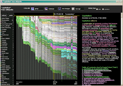
 New toys from the MIT Media Lab! This nifty picture is a "history-flow" visualization of edits to the Wikipedia entry for "Capitalism." Each parallelogram represents a unique sentence or paragraph. The 'Y' axis represents time. Therefore, the "wavy" lines represent periods where a particular claim was heavily contested by users, or-- sadly-- the U.S. government. The program uses Wikipedia "meta" data, which can be easily downloaded here.
Upon further investigation I discovered a lively literature on the social production of knowledge in Wikipedia. Needless to say, these folks couldn't spot A.N.T. in a pile of T.P.S. Reports. But should we sociologists care? After all, about 5% of Wikipedia users write 95% of the entries. Moreover, much of the edit history is coordinated by a cadre of computer scientists with an uncommon obsession with punctuation and grammar. Still, a quick glimpse at the data yielded a few promising controversies (including a four week battle about the proper definition of "terrorism."). In the end, this may be further evidence of my ongoing obsession with pretty pictures of social science.


No comments:
Post a Comment